
Haibrid is a workspace for uninterrupted research - built to help you save, organize, and synthesize insights with full traceability and AI support.
2024-Present
Product Designer
B2B / B2C / SaaS / Web / Extension

Setting the Stage
Haibrid is a research workspace tailored for researchers, traders, and marketers. The main goal of this redesign was to enhance user experience by streamlining user flows and modernizing the user interface.
As the sole designer on this project, I led the entire redesign process, applying my expertise in User Experience and User Interface design. Key skills I employed included creating intuitive information architecture, developing clean and functional visual designs, and managing the project end-to-end.
This redesign significantly improved the platform's usability and aesthetic appeal, making it a more effective tool for our users.
Identifying Pitfalls
Problem Statement
The Haibrid platform, originally designed to support diverse research activities, suffered from an outdated design and unintuitive usability. This led to inefficiencies and a frustrating user experience, making it challenging for researchers, traders, and marketers to navigate and utilize the platform effectively.
To address these issues, I focused on modernizing the visual aesthetics and simplifying the user interface to enhance usability. By streamlining workflows and introducing a customizable, responsive design, I aimed to improve overall user satisfaction and productivity. My goal was to make Haibrid a more versatile and accessible tool, ensuring it meets the evolving needs of researchers, traders, and marketers more effectively.
Aiming High
The Haibrid redesign was driven by specific business and user goals intended to enhance both functionality and market competitiveness.
Business Goals
Increase Conversion Rates: Simplify and optimize the user journey and enhance the interface to attract and retain more users.
Enhance Brand Perception: Modernize the interface to reinforce Haibrid as a leading-edge tool.
Drive User Retention: Develop a more intuitive and customizable interface to boost user satisfaction and loyalty.
User Goals
Improve User Engagement: Redesign the interface to be more interactive, enhancing user connection and involvement.
Increase Efficiency and Productivity: Streamline workflows to enable quicker and more efficient task completion.
Enhance Accessibility: Improve platform accessibility to support users with diverse needs, ensuring inclusivity.
These goals are designed to make Haibrid not only more appealing to new users but also more valuable to our existing community by facilitating a seamless and productive user experience.
Diving Deep
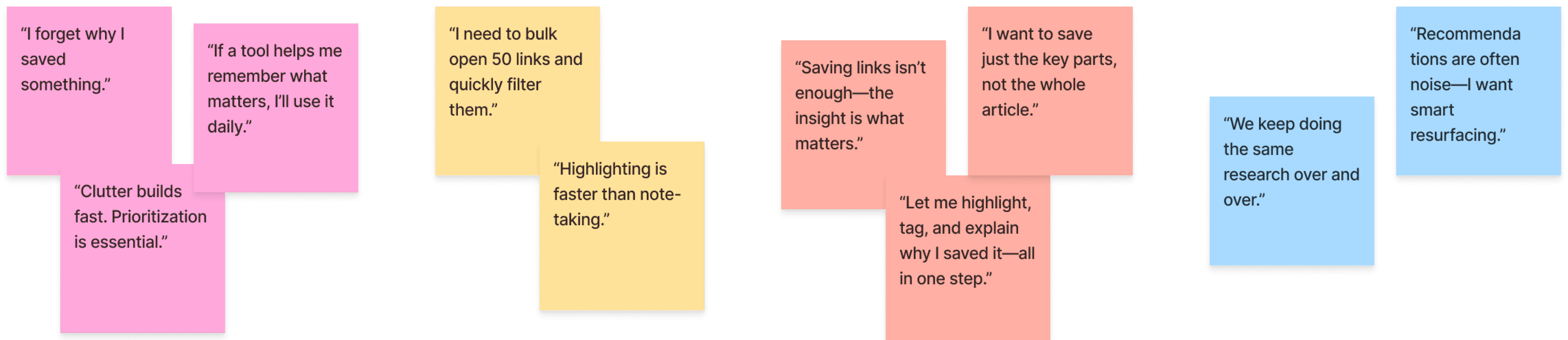
To better understand user behavior and pain points, I conducted interviews during onboarding sessions to observe how users interacted with the existing platform. This helped uncover friction in workflows and gaps in usability. I also performed a thorough audit of current features to identify what needed improvement.
During onboarding interviews, I gathered direct quotes and grouped them by theme -- each sticky note represents a key insight that informed the redesign.
🧠 Mental Load & Recall
⚡ Workflow Speed
✂️ Saving Smarter
🔁 Reusability & Discovery
🧠 Mental Load & Recall

⚡ Workflow Speed

✂️ Saving Smarter

🔁 Reusability & Discovery

Since Haibrid has no direct competitors, I analyzed a range of tools like note-taking apps, bookmarking extensions, and research platforms to draw inspiration and benchmark specific features like tagging, search, and collaboration.
Crafting the User Journey
To shape a seamless user experience, I began by mapping user flows and defining key interaction points. This high-level flow clarified how users move through the product -- from signing in to exploring projects, adding sources, chatting with AI, or creating documents.
Here’s a simplified version of the main user journey:
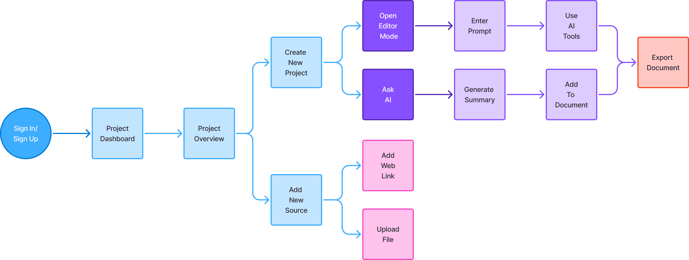
These flows shaped the structure of low-fidelity wireframes focused on simplifying navigation and making core actions -- like saving, tagging, and organizing sources -- feel intuitive. I built interactive prototypes to validate assumptions, refining layouts through internal testing and peer reviews. This helped surface friction points early and confirm what worked.
Visually, I applied a clean, neutral aesthetic accented with calming blues to strike a balance between clarity and modernity. Typography choices emphasized readability and hierarchy across screen sizes.
Designing from the Ground Up
Established a component-based system to streamline design updates, ensuring visual consistency and faster iteration. This system helped speed up development, while ensuring visual consistency and design clarity.

Shaping the Solution
After designing the core experience, I validated usability through internal testing and quick-turnaround peer reviews. I observed where users hesitated, where interactions felt too hidden, and what delighted them.
I prioritized fast iterations, testing across devices to fine-tune responsiveness and clarity. This helped me ensure the platform stayed intuitive even as new AI features were added.
Through this process, I saw measurable improvements in user engagement, speed of task completion, and clarity of navigation. These insights didn’t just improve the UI -- they shaped how users flowed through the product.
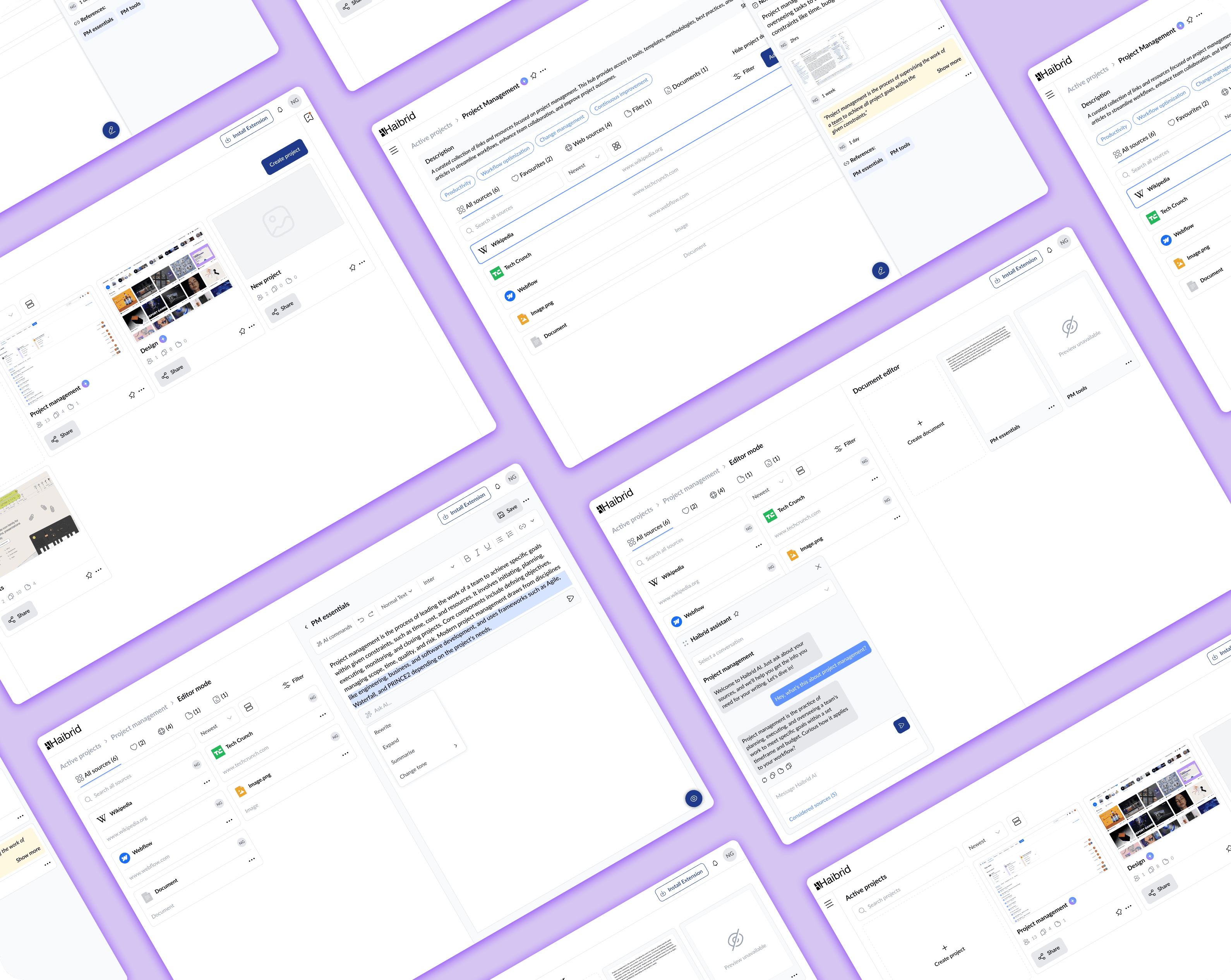
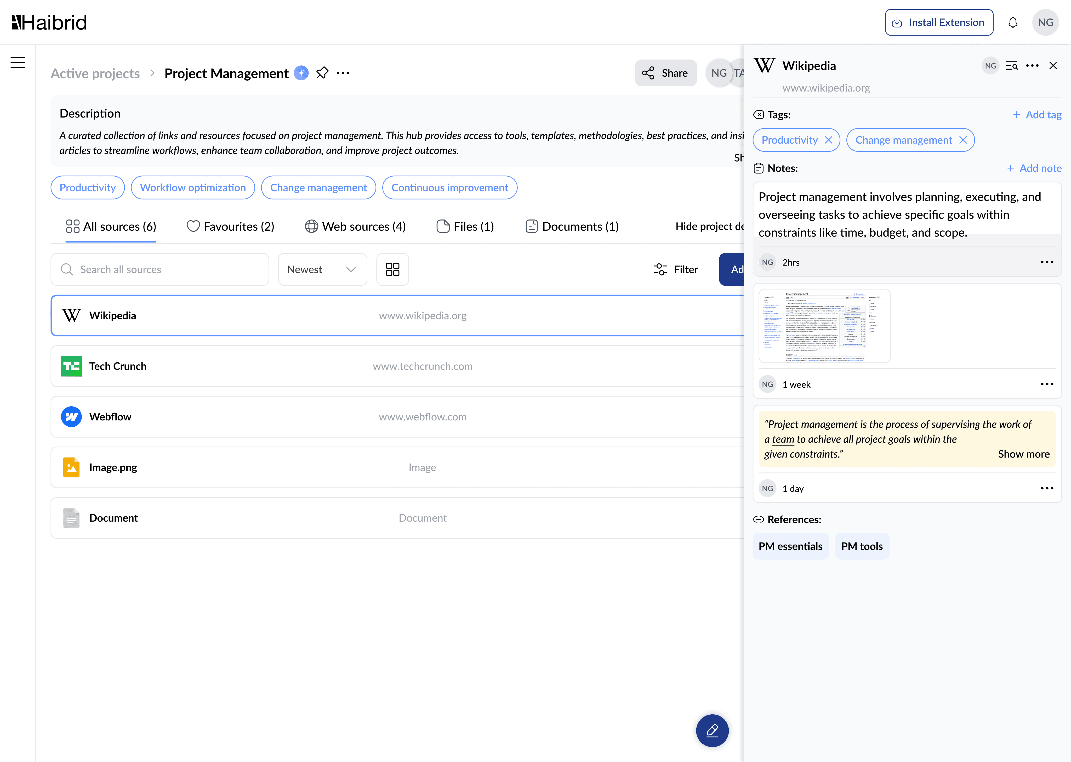
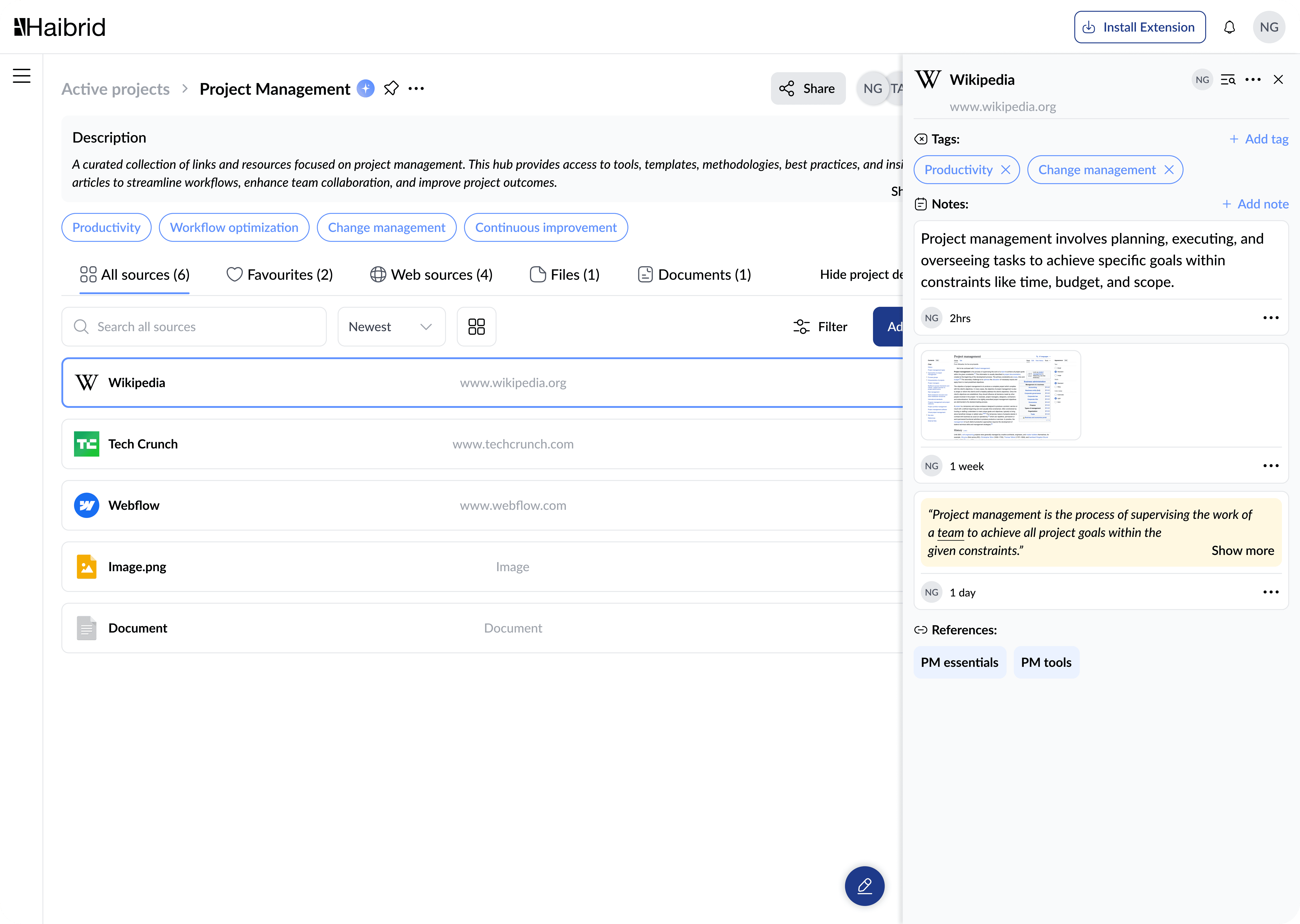
Refreshed Project Dashboard
Redesigned the layout to make viewing and editing source details more intuitive—streamlining how users filter, tag, and manage research at scale.

Organized Source Overview
Simplified how users view and edit source details, making it easier to tag, filter, and manage large research sets without friction.
AI-Powered Document Editor
Brought structure to collaborative writing with improved editor layout, inline formatting, and smooth source referencing.
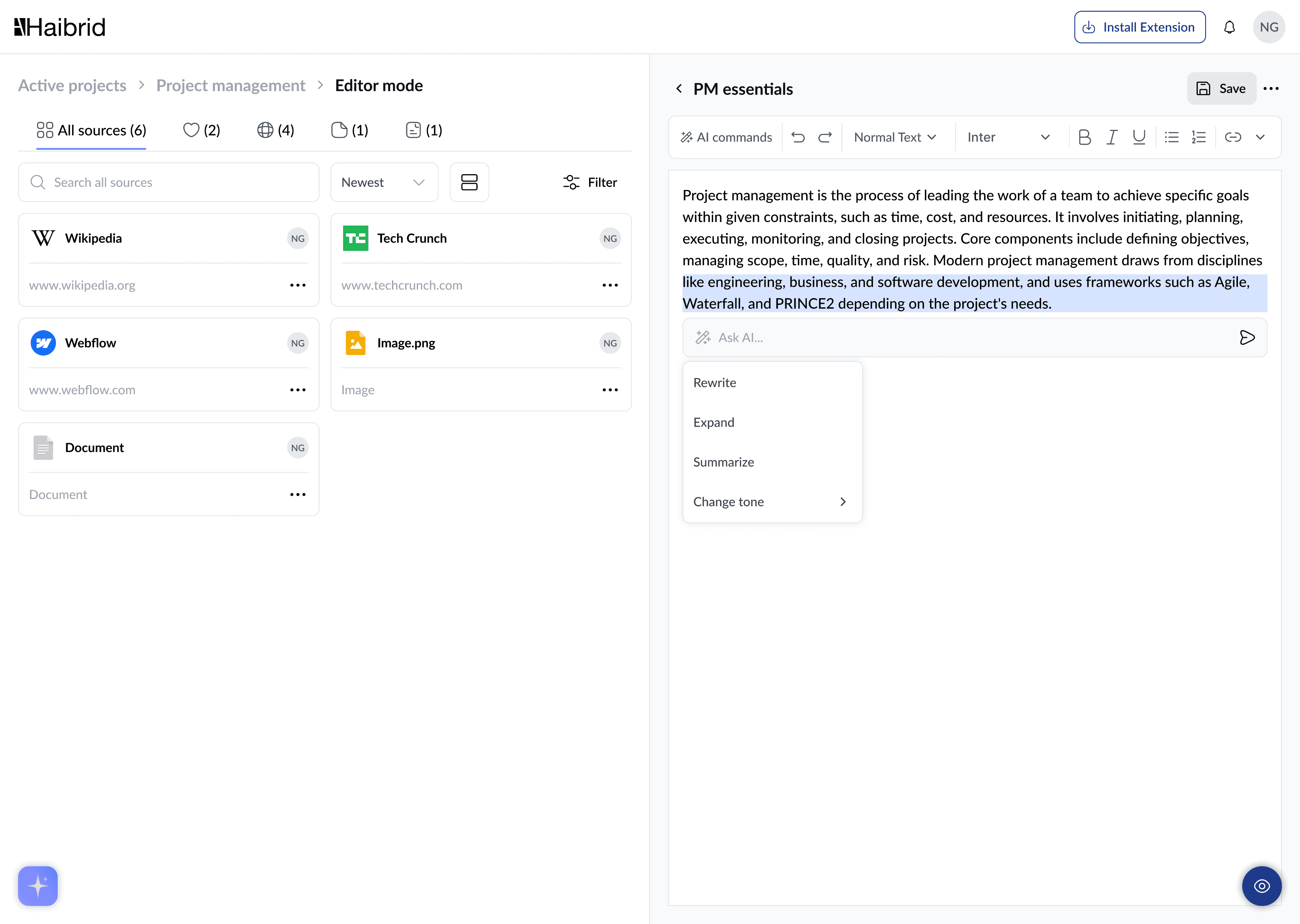
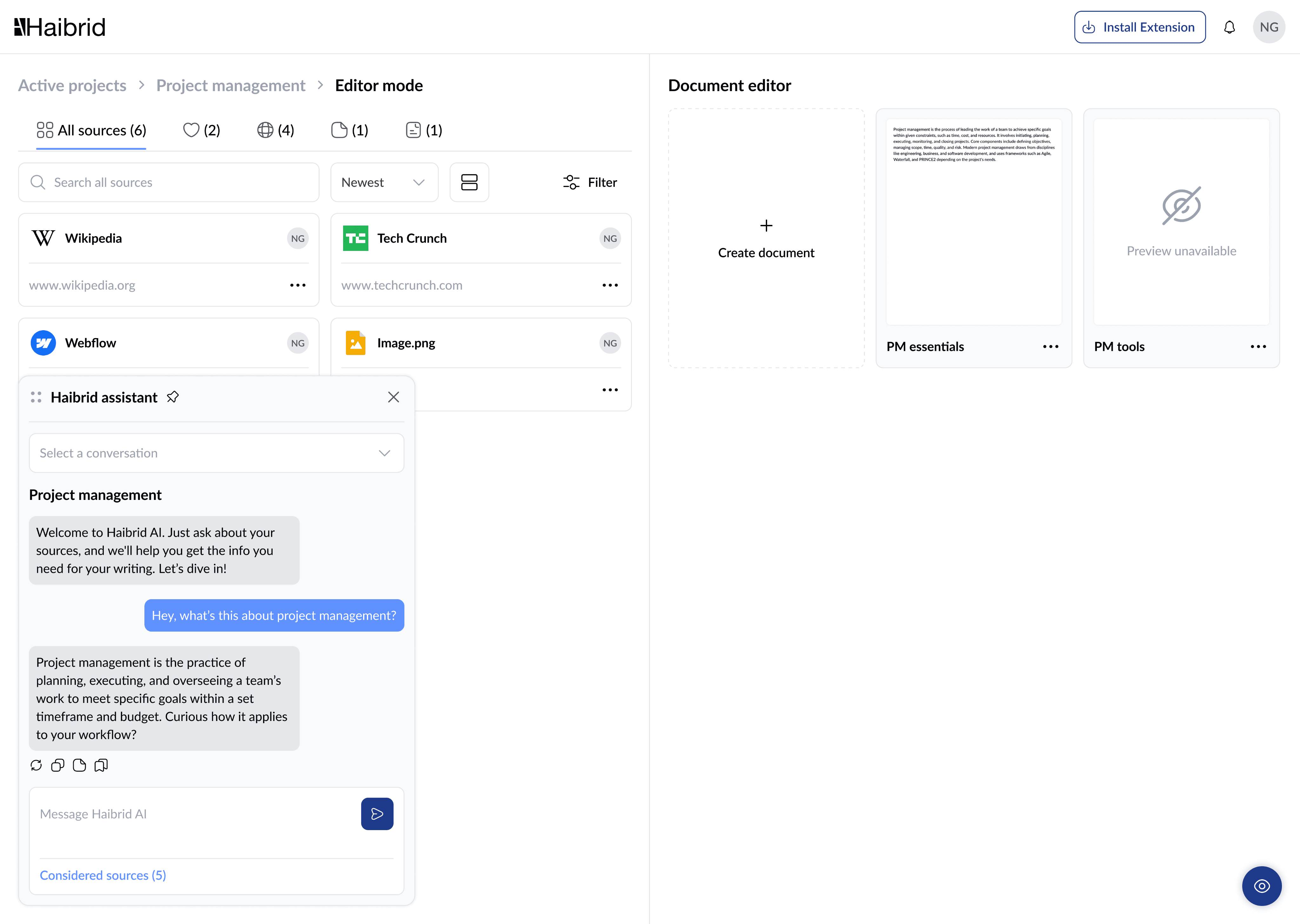
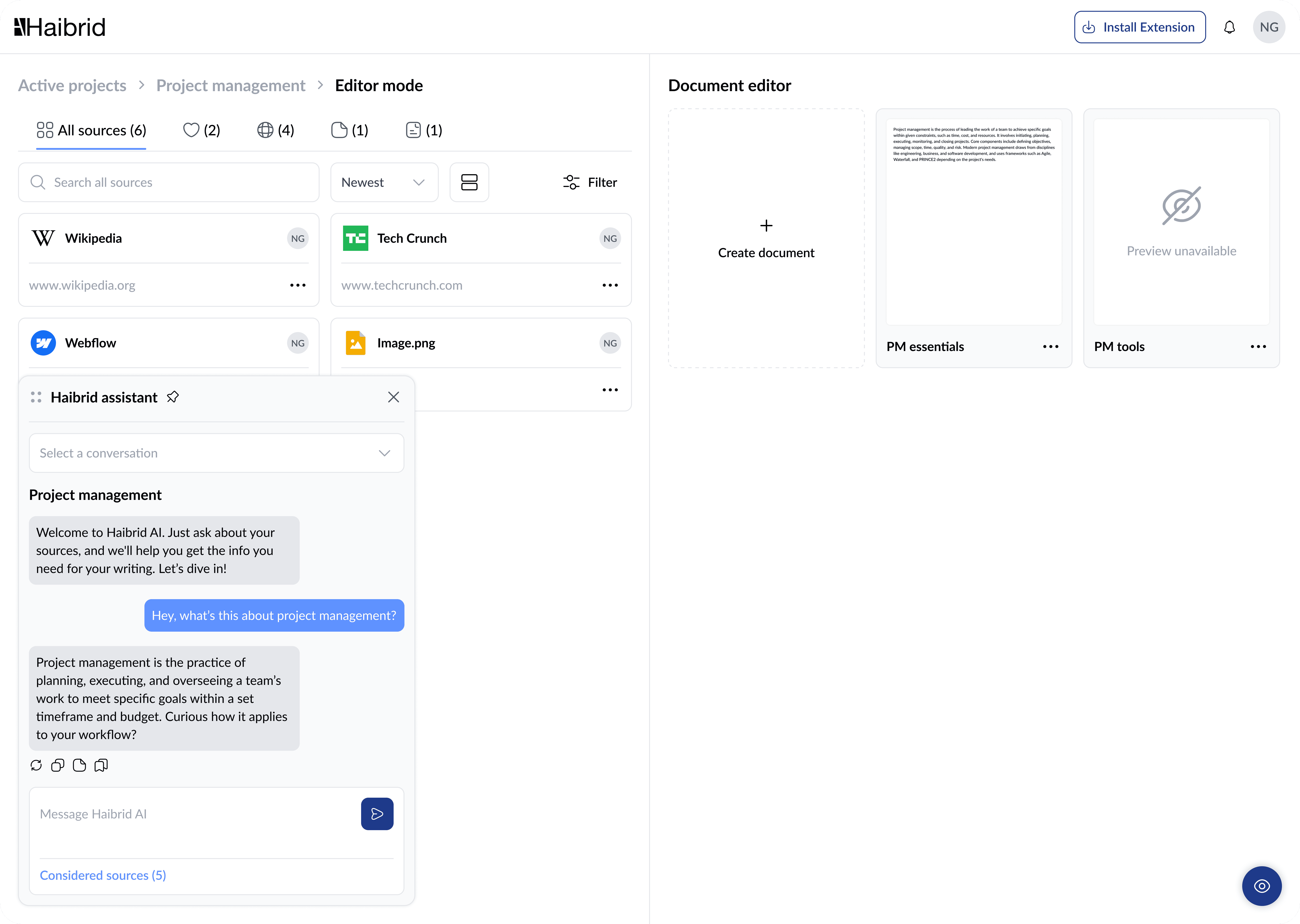
AI Assistant for Source-Based Writing
Designed an AI assistant that transforms saved research into helpful, contextual answers -- accelerating insight-driven writing.
Wrapping Up!
This redesign wasn’t just about UI polish -- it was a deep dive into user behavior, product complexity, and systems thinking. It pushed me to reflect on the process and sharpen my skills.
Wearing multiple hats across research, UX, and visual design, I helped guide Haibrid toward a more intuitive and scalable experience -- while building a flexible design system to support future growth.

Key Skills Strengthened:
UX writing & microinteractions
Atomic design
User flow mapping & prototyping
Collaborating closely with founders, devs, and early adopters
Haibrid is a workspace for uninterrupted research - built to help you save, organize, and synthesize insights with full traceability and AI support.
2024-Present
Product Designer
B2B / B2C / SaaS / Web / Extension
Setting the Stage
Haibrid is a research workspace tailored for researchers, traders, and marketers. The main goal of this redesign was to enhance user experience by streamlining user flows and modernizing the user interface.
As the sole designer on this project, I led the entire redesign process, applying my expertise in User Experience and User Interface design. Key skills I employed included creating intuitive information architecture, developing clean and functional visual designs, and managing the project end-to-end.
This redesign significantly improved the platform's usability and aesthetic appeal, making it a more effective tool for our users.
Identifying Pitfalls
Problem Statement
The Haibrid platform, originally designed to support diverse research activities, suffered from an outdated design and unintuitive usability. This led to inefficiencies and a frustrating user experience, making it challenging for researchers, traders, and marketers to navigate and utilize the platform effectively.
To address these issues, I focused on modernizing the visual aesthetics and simplifying the user interface to enhance usability. By streamlining workflows and introducing a customizable, responsive design, I aimed to improve overall user satisfaction and productivity. My goal was to make Haibrid a more versatile and accessible tool, ensuring it meets the evolving needs of researchers, traders, and marketers more effectively.
Aiming High
The Haibrid redesign was driven by specific business and user goals intended to enhance both functionality and market competitiveness.
Business Goals
Increase Conversion Rates: Simplify and optimize the user journey and enhance the interface to attract and retain more users.
Enhance Brand Perception: Modernize the interface to reinforce Haibrid as a leading-edge tool.
Drive User Retention: Develop a more intuitive and customizable interface to boost user satisfaction and loyalty.
User Goals
Improve User Engagement: Redesign the interface to be more interactive, enhancing user connection and involvement.
Increase Efficiency and Productivity: Streamline workflows to enable quicker and more efficient task completion.
Enhance Accessibility: Improve platform accessibility to support users with diverse needs, ensuring inclusivity.
These goals are designed to make Haibrid not only more appealing to new users but also more valuable to our existing community by facilitating a seamless and productive user experience.
Diving Deep
To better understand user behavior and pain points, I conducted interviews during onboarding sessions to observe how users interacted with the existing platform. This helped uncover friction in workflows and gaps in usability. I also performed a thorough audit of current features to identify what needed improvement.
During onboarding interviews, I gathered direct quotes and grouped them by theme -- each sticky note represents a key insight that informed the redesign.
🧠 Mental Load & Recall
⚡ Workflow Speed
✂️ Saving Smarter
🔁 Reusability & Discovery
Since Haibrid has no direct competitors, I analyzed a range of tools like note-taking apps, bookmarking extensions, and research platforms to draw inspiration and benchmark specific features like tagging, search, and collaboration.
Crafting the User Journey
To shape a seamless user experience, I began by mapping user flows and defining key interaction points. This high-level flow clarified how users move through the product -- from signing in to exploring projects, adding sources, chatting with AI, or creating documents.
Here’s a simplified version of the main user journey:
These flows shaped the structure of low-fidelity wireframes focused on simplifying navigation and making core actions -- like saving, tagging, and organizing sources -- feel intuitive. I built interactive prototypes to validate assumptions, refining layouts through internal testing and peer reviews. This helped surface friction points early and confirm what worked.
Visually, I applied a clean, neutral aesthetic accented with calming blues to strike a balance between clarity and modernity. Typography choices emphasized readability and hierarchy across screen sizes.
Designing from the Ground Up
Established a component-based system to streamline design updates, ensuring visual consistency and faster iteration. This system helped speed up development, while ensuring visual consistency and design clarity.
Shaping the Solution
After designing the core experience, I validated usability through internal testing and quick-turnaround peer reviews. I observed where users hesitated, where interactions felt too hidden, and what delighted them.
I prioritized fast iterations, testing across devices to fine-tune responsiveness and clarity. This helped me ensure the platform stayed intuitive even as new AI features were added.
Through this process, I saw measurable improvements in user engagement, speed of task completion, and clarity of navigation. These insights didn’t just improve the UI -- they shaped how users flowed through the product.
Refreshed Project Dashboard
Redesigned the layout to make viewing and editing source details more intuitive—streamlining how users filter, tag, and manage research at scale.

Organized Source Overview
Simplified how users view and edit source details, making it easier to tag, filter, and manage large research sets without friction.
AI-Powered Document Editor
Brought structure to collaborative writing with improved editor layout, inline formatting, and smooth source referencing.

AI Assistant for Source-Based Writing
Designed an AI assistant that transforms saved research into helpful, contextual answers -- accelerating insight-driven writing.
Wrapping Up!
This redesign wasn’t just about UI polish -- it was a deep dive into user behavior, product complexity, and systems thinking. It pushed me to reflect on the process and sharpen my skills.
Wearing multiple hats across research, UX, and visual design, I helped guide Haibrid toward a more intuitive and scalable experience -- while building a flexible design system to support future growth.
Key Skills Strengthened:
UX writing & microinteractions
Atomic design
User flow mapping & prototyping
Collaborating closely with founders, devs, and early adopters